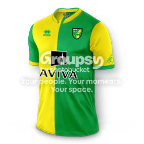
New Home Kit

The Great Mass Debater

The Great Mass Debater

New Member
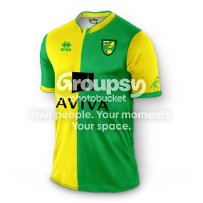
ncfc%20halfnhalf.png


My take on a half and half that is a bit more modern, though it could have the same collar as the new kit, I just quickly changed some colours on a design I had to make it half and half. The aviva logo in black so you don't have to cut a block out of the green, it could even have a white border to stand out more like the names and numbers would have on the back. I don't really like half and half's though so something simple would have been good.


I prefer yours
 
Scott

Scott

Active Member
ncfc%20halfnhalf.png


My take on a half and half that is a bit more modern, though it could have the same collar as the new kit, I just quickly changed some colours on a design I had to make it half and half. The aviva logo in black so you don't have to cut a block out of the green, it could even have a white border to stand out more like the names and numbers would have on the back. I don't really like half and half's though so something simple would have been good.
Much nicer, do you want a job in Errea sir?
 
The Great Mass Debater

The Great Mass Debater

New Member
Odd how we seem to be agreeing that the above shirt looks better, but they made what they made, and theyre supposed to be the experts...
 
Macey

Macey

New Member
Well I wouldn't be surprised if the errea designer done the shirt full half and half, but aviva didn't like it because the blue logo blended in so they had their say... If I was the designer I would have said to aviva ok how can we make the logo better so it stands out without changing the shirt design. I mean mine is just the same as whats be done, if they would have changed the aviva logo its doable.
 
The Great Mass Debater

The Great Mass Debater

New Member
Cant see why Aviva would object to your solution, the whole thing looks so much more elegant. Everybody wins
 
The Great Mass Debater

The Great Mass Debater

New Member
Saw this on Twitter - can see why Aviva wouldnt like it, but think its a poor solution

CI0WuzFW8AEN_K9.png
 
Macey

Macey

New Member
just stuck a white border around the aviva logo so you can see how it pops.

ncfc%20halfnhalf_1.png


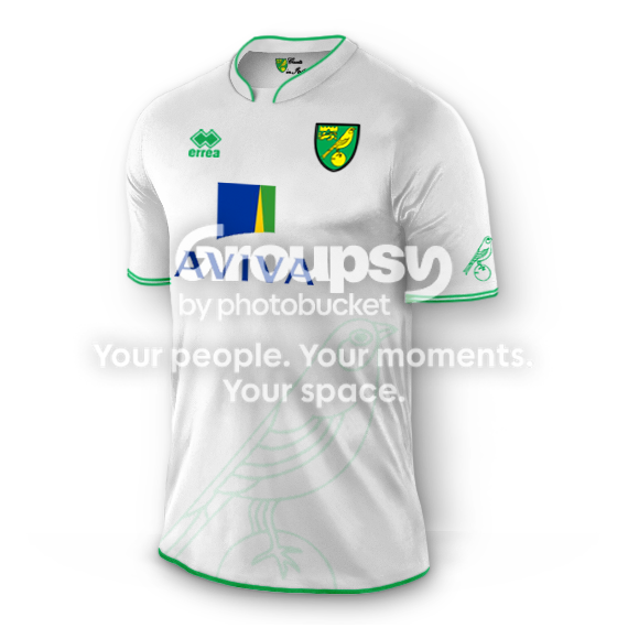
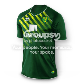
I done several designs in the past that I posted on the pink'un, heres what I would like to see as the away shirt, I think from the image that was on twitter it will be green and white.

ncfcawaywhite2.png


NCFCawaydarkgreensmall.png


Sorry I had not resized the white one.
 
morty

morty

Moderator
Staff member
End of the day though Aviva have their logo, in the format they want to be recognised, and they are paying us money. To them their logo is more important than our shirt.
 
dj161

dj161

Well-Known Member
Im not a fan of either to be honest, one thing i dont understand is why is 80 years such a landmark, seems a bit odd, you'd of thought they'd of done something after 75 years or left it until the 100, but 80 just seems like a strange number to be doing it at
 
M

Moosheep

New Member
Aviva will have their brand guidelines, which will have been produced at huge expense and run to many many pages. The shirt designers will have had to work to these. I would guess that what we have ended up with is the best they could come up with in the circumstances.

Agree with dj161 though, what is so special about 80 years?
 
  • Like
Reactions: ZLF
splutcho

splutcho

Moderator
That is absolutely hideous. What on earth were they thinking with the huge yellow panel? If Aviva came back and said that was the only way we could do half and half then the whole thing should have been scrapped and a new design found.
 
Din

Din

Well-Known Member
It's just awful to be honest. I like the half and half idea but it's not half an half at all. Terrible.

Anyone know when the away kit gets released?
 
Gaffer

Gaffer

Active Member
The last two home kits grew on me but this one is having the opposite effect. The big yellow square really is a distracting eyesore.
 
Boyerboy

Boyerboy

New Member
It adds insult to injury when they follow up this abortion with a ludicrous back story trying to say it was all deliberately when it's obviously the proverbial committee camel
 
Lone Star Canary

Lone Star Canary

New Member
Here's my take... I'm seeing a lot of justification based on Aviva's brand guidelines that are for websites, not attire.  Attire is a different animal because you really limit what you can do if you can't slap your brand on a multi-colored background.  I guess this means that Aviva wouldn't go along with an updated retro of the birdsh*t shirt.

Anyway, there's been some variations posted already, but my thought is to use a thin yellow outline to add contrast.  It keeps Aviva clearly identifiable, while improving the overall base design immensely.

This is a rush job, so quality of the texturing of the green half is a little wonky...

O2nu8Tp.jpg
 
Macey

Macey

New Member
Here's my take... I'm seeing a lot of justification based on Aviva's brand guidelines that are for websites, not attire.  Attire is a different animal because you really limit what you can do if you can't slap your brand on a multi-colored background.  I guess this means that Aviva wouldn't go along with an updated retro of the birdsh*t shirt.

Anyway, there's been some variations posted already, but my thought is to use a thin yellow outline to add contrast.  It keeps Aviva clearly identifiable, while improving the overall base design immensely.

This is a rush job, so quality of the texturing of the green half is a little wonky...

O2nu8Tp.jpg
Yup that works too, let face it pretty much anything others have mentioned would have been better.
 
Suffolk Canary

Suffolk Canary

New Member
Im not a fan of either to be honest, one thing i dont understand is why is 80 years such a landmark, seems a bit odd, you'd of thought they'd of done something after 75 years or left it until the 100, but 80 just seems like a strange number to be doing it at
Probably because with Erra's deal they have with the club, this is the only year which they can really milk as some kind of special occasion. 
 
Canaryboy

Canaryboy

Well-Known Member
Odd how we seem to be agreeing that the above shirt looks better, but they made what they made, and theyre supposed to be the experts...
I guess that Aviva were not prepared to change the colour of their logo to suit the shirt.

But I'd even have preferred a white box going evenly over both the green and yellow, with the Aviva logo within that. 

I've got a theory though that the popularity of a shirt in the future depends on how successful we were in that shirt. People love the bird poo kit despite the wider football word rating it as one of the worst ever, so perhaps we can win the FA Cup in this and people will be paying 3 x original RRP for it on ebay in 20 years.
 
Last edited by a moderator:

Sit with the City fans who turn up

Free to join, free to read. Introduce yourself, pick a player thread, and get stuck into the next match thread.

Create a free account
Top